

A bar chart should do more than show you which category is bigger.
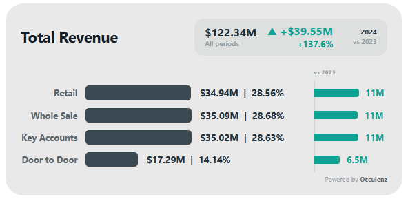
The Occulenz Comparison Bars Chart was built to bring the current value, historical comparison, change, contribution, and overall context together in one visual — without rebuilding the same comparison logic every time you create a report.
Simply add your Category, Date, and Value, then choose how you want to analyze the data.
Compare the way you need
Switch between:
- Year
- Quarter
- Month
- Week
- Day
Then compare against the previous period or the same period last year without creating a separate measure for every scenario.
The visual can also automatically work with the latest completed period, helping you avoid comparing an incomplete period against a complete one.
See the change, not just the value
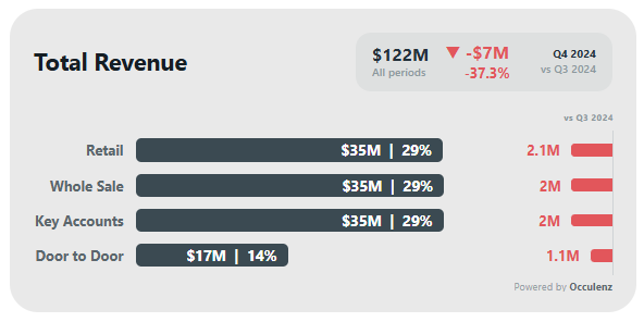
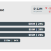
The dedicated Comparison Column makes increases and decreases immediately visible alongside the main bars.
Show:
- Change amount
- Change percentage
- Or both
while keeping the comparison directly connected to each category.
Everything in one view
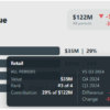
The built-in Totals Card can display the overall value, the change between periods, and the periods being compared — without needing to build separate cards around the chart.
Smart by default. Fully customizable when you need it.
The visual automatically adjusts its typography, spacing, sizing, and layout according to the available space.
Resize the visual and it adapts automatically.
Want full control? Override any setting manually and the visual respects your choice.
Built for real analysis
You can also:
- Show Top N categories
- Sort by value, change, or category
- Display values, percentages, or both
- Automatically position value labels based on available space
- Use different colors by category
- Customize positive and negative comparison colors
- Control currency and decimal formatting from one place
- Customize the Totals Card, Comparison Column, canvas, spacing, and typography
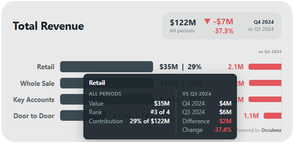
- Use either the Occulenz Tooltip or the native Power BI Tooltip
And that’s only part of what’s included.
Less setup. More analysis.
Bar Chart with Comparison was designed to reduce repeated report-building work and give you a flexible comparison experience directly inside the visual.
No separate comparison measure for every period.
No rebuilding the same layout for every report.
No fighting with formatting every time the visual size changes.
Just connect your data, choose the analysis you need, and start exploring.
Free by Occulenz
This is the first Power BI Custom Visual from Occulenz — and it’s only the beginning.
We’re building tools and visuals around real problems that data professionals face every day.
Occulenz
See deeper. Think clearer.
Reviews
There are no reviews yet.